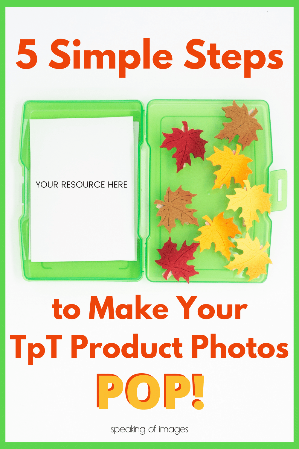
You know that one friend who can pull an outfit together from any five random clothing pieces? Or the one who can change the whole look of a room by rearranging the furniture, and then adding some pillows and a throw blanket? You can be that person when it comes to your product photos. Having TpT product photos that POP is not as hard as it may seem. Today I’m sharing my design process with you.
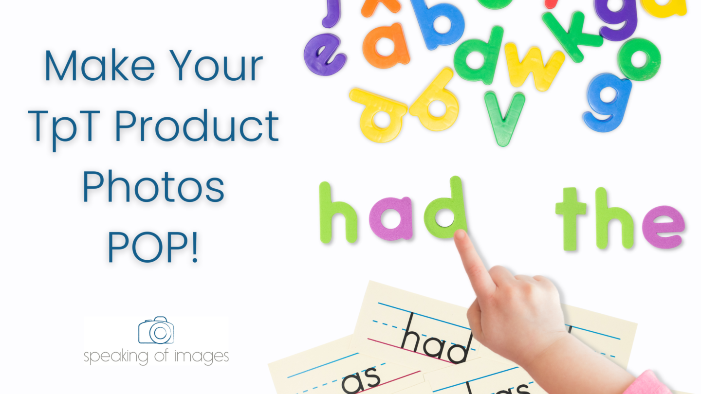
Creating a product image using mock ups and moveable pieces is simply a matter of layering. It all comes down to combining different assets to make a final look that just feels good to the eye.
You can learn to build amazing images using some simple but strategic steps.
By following these steps when you can create product photos, you can make your TpT product photos pop.
Using Flat Lay Methods to Your Advantage
Flat lay photography is a method of showcasing a product that has been thoughtfully styled and then photographed from above. This gives you that “birds-eye view” of the item. If you pay attention you will see flat lay images all over social media posts and marketing ads.
One way to create flat lay images without picking up a camera is to use mock ups and moveable images. Thousands of these assets are available in the Image Maker membership, where you can access beautiful flat lay mock ups, or use the moveable pieces to create your own unique images to feature your product.
Steps for Creating Product Photos using Moveable Pieces
Here are 5 steps to follow when building unique flat lay images with moveable pieces. By following these steps and tips, you will be on your way to creating eye-catching product photos for your TpT products.
1. The Base Layer
When it comes to flat lay images we are going to start building the image from the bottom up. That means we are starting with the background. The background should lay the foundation for the feel of your image.
Tip: Choose a background that sets the stage by not being too busy.
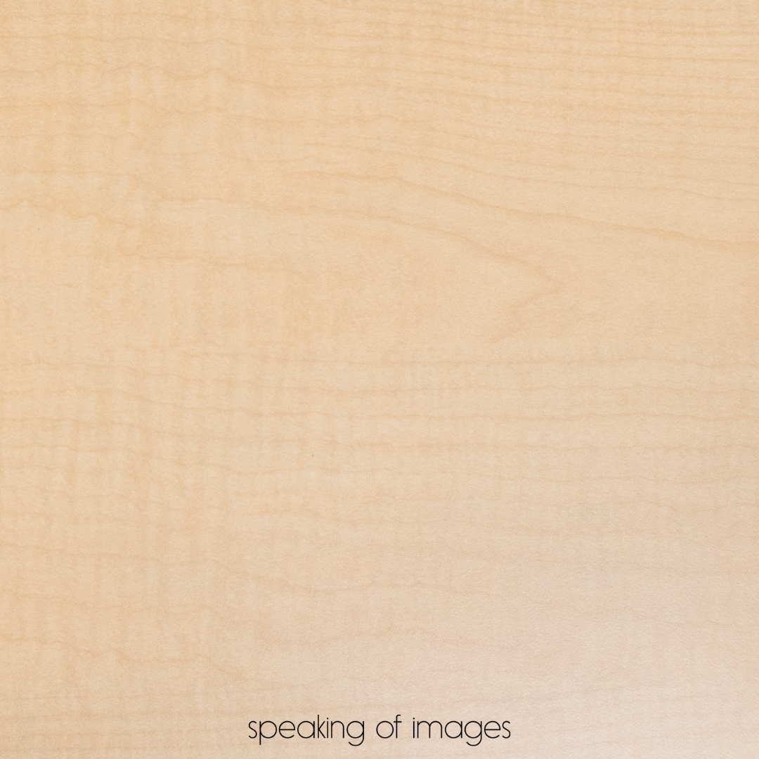
You might choose a solid color that creates a clean and crisp feel, like white or one of your brand colors. Another background option could relate the resource to where it might be used, like on a student’s desk. For this, a wood grain background, like the one pictured here works well.
As you choose the background, you may also want to consider if the look feels trendy. Trendy is not a bad thing, in fact, it can be really eye-catching when the trend is in. But, it can make resources look outdated when the trend is out. This might result in the need to create new photos as the trends change. Think about whether you want the trendy look or one that will stand the test of time.
2. Add Contrast
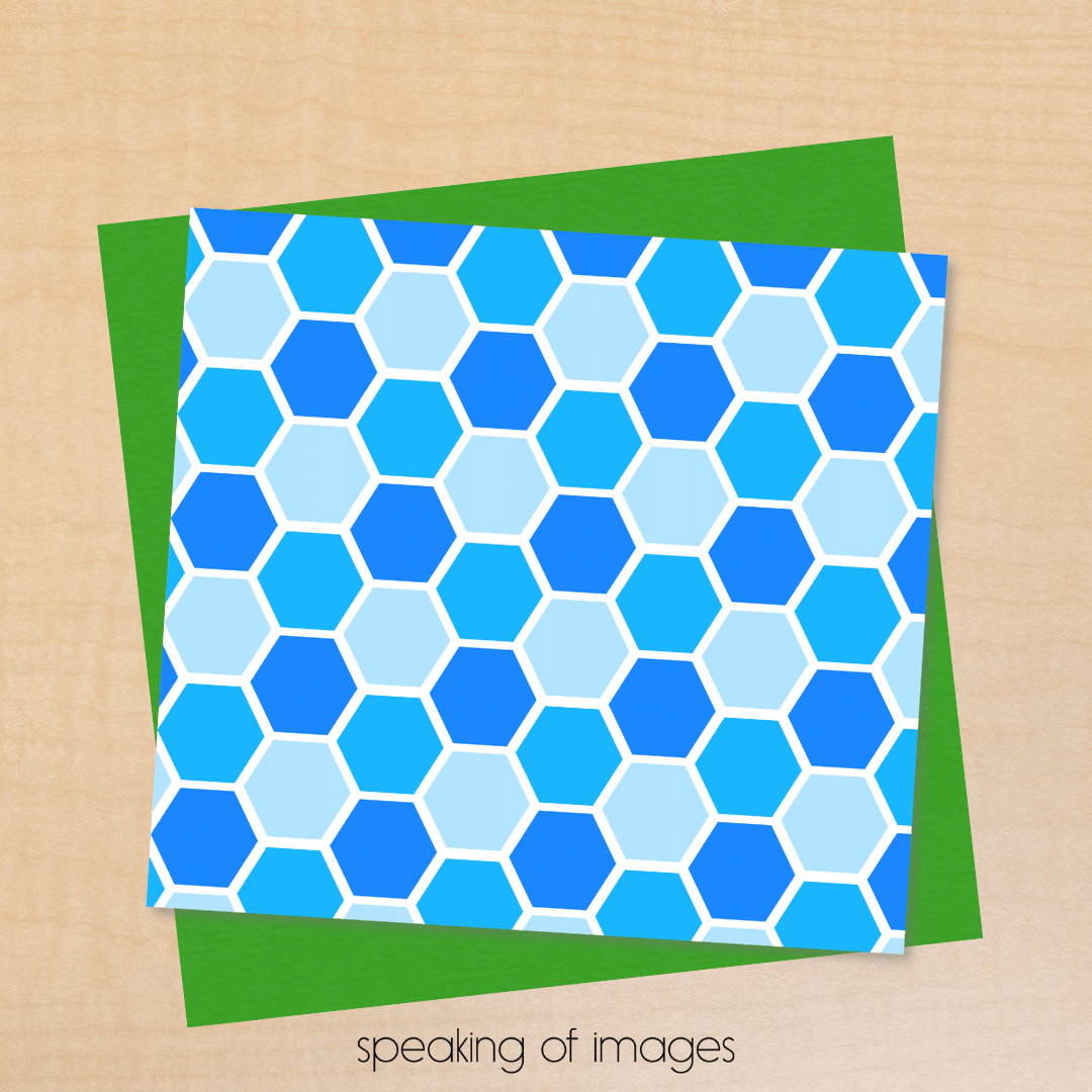
Once you have your background chosen it is time to think of the next layer as your build your photo. You want your product to be the focus of your image. Adding some contrast will help your product pop off that page.
If you are using a white background with a white paper product then this is a MUST! Otherwise, your product gets lost in the background. But even on other backgrounds adding a layer of contrast under your product can help it pop off the screen.
Tip: Consider the Color Wheel you learned about in art class when considering color combinations. You can find them online, too.
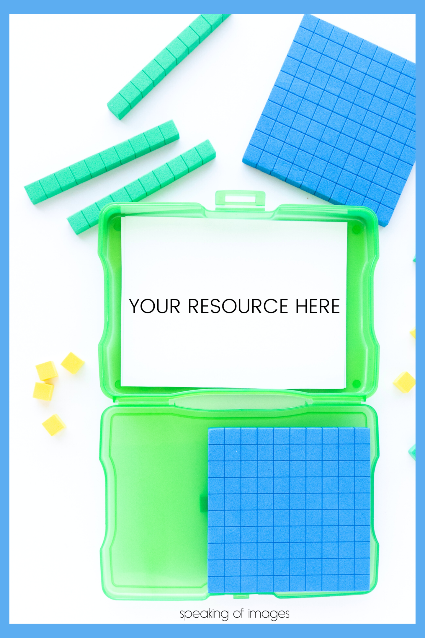
If you are shooting a white paper product you can frame it by placing it on top of a contrasting colored paper, a clipboard, or a tray. Bright plastic photo boxes that are often used for storing task cards create the perfect frame for a task card, puzzle, or other product with small pieces.
3. Add Your Product
Once you have added the background and contrast, you are ready to layer your product page in the photo. There are many ways you can get the image of your product to use for your flat lay.
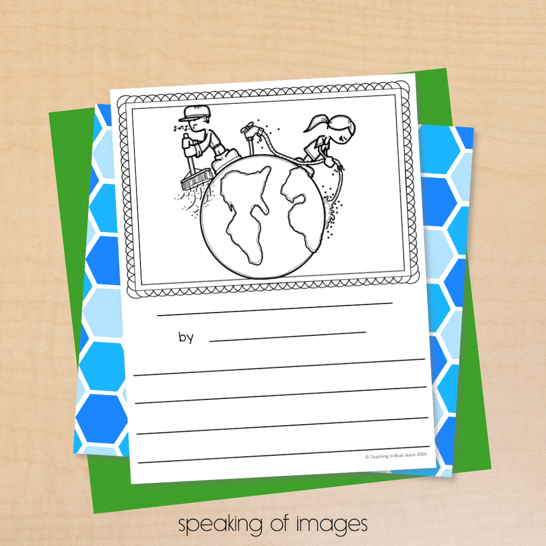
The fastest and easiest is to take a screenshot! Using your computer’s built-in screenshot tool select the page or portion of the page you want to feature. You can do this from a PDF, Powerpoint, or any program you are using to create your product.
Tip: If using screenshots make sure to adjust your computer settings so that you are getting a high-resolution screenshot image.
If you don’t want to use screenshots, then save your product as an image file. You can do this in Powerpoint, Adobe Reader, Google Slides, and most other programs that TpTers use to create resources.
Saving as a png will give you the highest quality image and will appear more crisp and clear than a jpeg. Like a screenshot, some of these programs allow you to change the quality or size of the image when you save as an image.
Tip: Try to get 300 dpi (dots per inch) or higher to get a good quality image.
4. Add Details to Your Product Photos
Physical Details
Now it’s time to add those finishing touches to your flat lay image. These are those details that really make the image unique to your product.
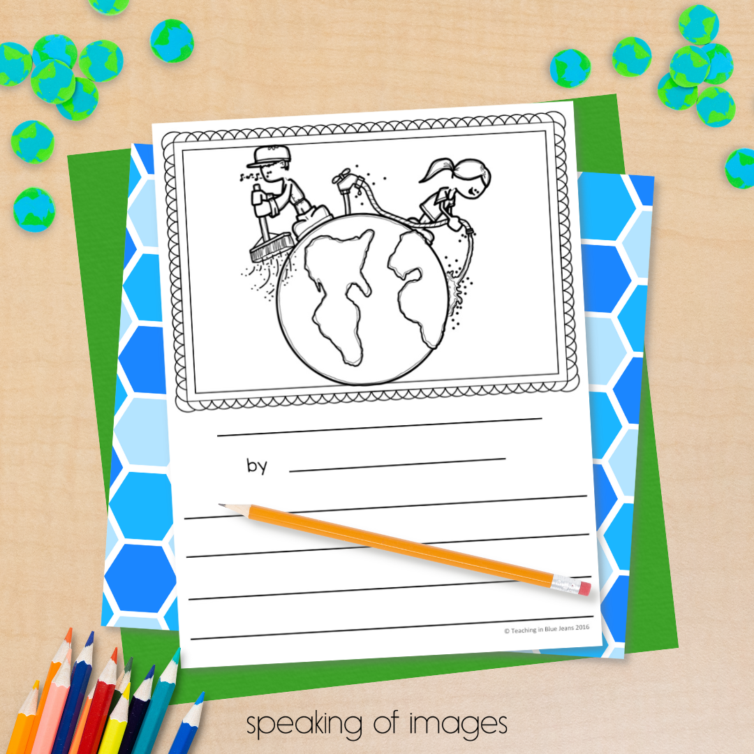
I suggest adding one of two types of detail elements. If a product has a seasonal or holiday theme, add details to show this off. If your product is evergreen, then focus on adding the tools or supplies a student might use to complete the activity pictured.
For example, if you have a literacy product for Kindergarten students, you might add magnetic letters. A math product for secondary students might include a calculator and/or a mechanical pencil. Be sure the details are age, grade, and subject matter appropriate.
Shadows
When you are creating an image using layered elements you don’t get the natural shadows that occur when you take a photo. But . . . you can add shadows using whatever program you are using to build your flat lay image.
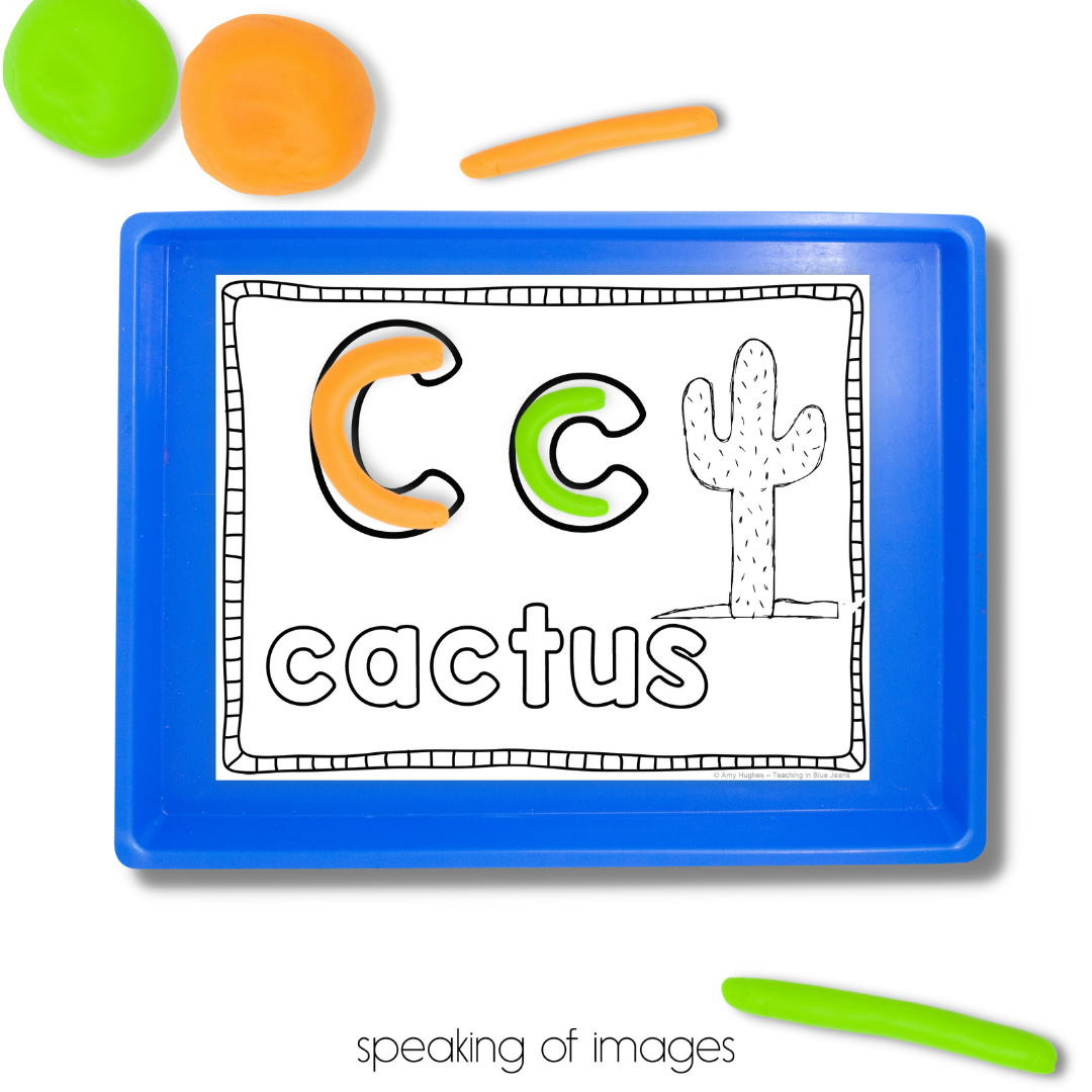
As you look at shadows on your image, make sure to take the time to play with the settings. More often than not, the standard setting will not give you the most realistic looking shadow. Shadows can be adjusted by size, transparency, and angle or distance from the object.
If you aren’t sure what would look best, just stop and take a moment to look around you. Look at the shadows that are on your desk. Place a pencil on a sheet of paper and see what the shadow looks like. Taking a minute or two to observe and learn from the natural environment will make your flat lay shadows easier to create.
5. Step Back and Look
Once you’ve worked through the steps above you are almost done. Before you hit save take a moment to step back and look at your photo. Looking at the photo in various sizes can help you see what it will look like on different platforms or devices.
What is your eye drawn to? Remember, the whole purpose of a product image to to make your resource the main attraction.
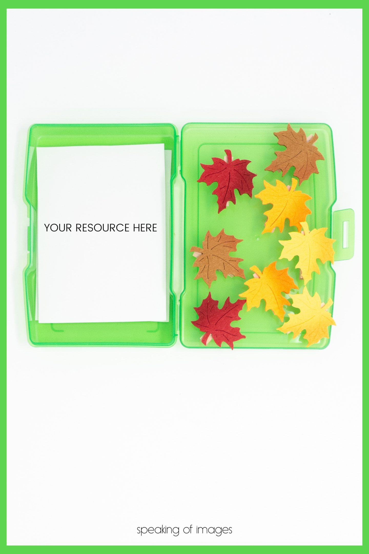
If you find that your image is looking too cluttered with added details, it’s time to edit some out. Sometimes it is as easy as using a pencil in a different color to bring the focus back to your product.
Empty space in an image is a good thing. Leave open space, or white space, in the image design. Just like a desk feels cluttered if it is covered with papers, markers, post-it notes, and coffee mugs, an image can give that same distracted feeling if there is too much going on in the layout.
Finally, think about where your image will be used. Will you need a bold title and subtitle as part of the final image? If so, do you have space available for that without cutting off your product? The image featured here shows plenty of space at the top and bottom for text to be added without distracting the eye from the resource. And . . . if you’d like to see how that was done, just scroll to the bottom of this post and see an example!
Looking to save even more time in image creation?

If you find yourself wanting to practice image creation using images that have already been created for you, then mock ups are the way to go.
Mock-up images already include the five steps we discussed. In a mock-up, everything is already laid out and photographed and all you need to add is your product. No need to worry about the shadows, they are naturally in the photographed set up.
Professionally styled, lit, and edited mock-up images can save you time by taking care of all of the background work. You simply drop in your product image, add your text, and you’re good to go.
In addition to a variety of educational and seasonal elements to build your own flat lay images, you can find thousands of mock-ups in the Image Maker membership gallery, too!
Want More Product Photo Creation Tips?
I love helping you create quality photos to show off your amazing educational resources. That’s why I created the Mockup Mastery for TpT Sellers Facebook group. This is a free group you can join that is filled with tips, ideas and collaboration all focused on creating product photos using mockups and visual elements.
I hope you will join us in the Facebook group!
Save these Tips for Creating Product Photos that Pop
Pin this to your favorite business Pinterest board so you can come back to review these tips and find more!
